

Friday, 21 June 2013
My End Of Year Show
This is a picture of me standing next to my work for the end of year show which took place in the shop. This piece along with 2 others are now within the college for show. Photos will be taken and placed on the next blog post.
Wednesday, 12 June 2013
Exhibition Shop
Today I was in the shop with Billie looking after everything and talking to customers who looked at the work if they wanted to. We were there from 3:15 till 5:10 and were the last to take care of the shop so we locked up. It was good to take care of the shop because it shows that we can be responsible. We got a few people come in and show interest :)
B Road Britain
Today I got a brief from Steve Taylor, short and sweet, cutting straight to the chase. Steve is doing a B Road Britain ride next year where he will ride around Britain on a 50cc Moped. He will be riding through Ireland, Scotland, Wales and of course England entirely through back roads not used as much to raise money for MS. Having MS himself he is risking his life to save others. I was more than happy to accept this request from Steve and can't wait to see what I come up with.
Saturday, 8 June 2013
Engraving Art - what you need?
Things that are needed for the engraving, (Things that came from the pack and some things from your house) shown below.
 A table would be useful to lean on, preferably one that is steady because you will be there for a while engraving the A4 page. Something to lean the card on (another piece of clear card is in the pack so I am leaning it on that), the card you are engraving, the engraving pen to scratch away the black paint and reveal a beautiful silver pattern. The Things you will need from home is paper to lean your hands on so you do not get finger prints on while working, a damp cloth to wipe away the scrapings from the card while you work, tissue to dry it if still working on the area and some music as you will be there for a while. Keep snacks close by in case you get peckish.
A table would be useful to lean on, preferably one that is steady because you will be there for a while engraving the A4 page. Something to lean the card on (another piece of clear card is in the pack so I am leaning it on that), the card you are engraving, the engraving pen to scratch away the black paint and reveal a beautiful silver pattern. The Things you will need from home is paper to lean your hands on so you do not get finger prints on while working, a damp cloth to wipe away the scrapings from the card while you work, tissue to dry it if still working on the area and some music as you will be there for a while. Keep snacks close by in case you get peckish.
Picture shows that I have started. It is a fun process and interesting to experiment with :)
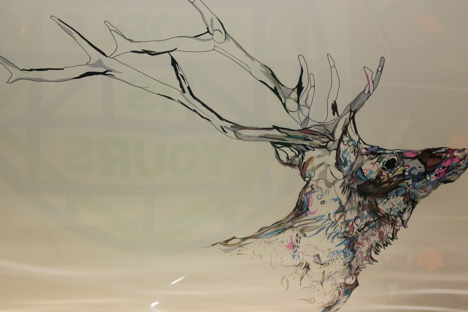
Engraving
Got an engraving set from nan to give a go so giving it a try now. Will be nice to see a different effect and technique of art :)

Friday, 7 June 2013
End Of Year Show Piece
My A1 piece up at the show. Taken from a distance. Show is almost finished just a few more things that will have to be done before the start. Everything looks good and today we created more badges.

Thursday, 6 June 2013
Rik Lee

 |
 |
http://www.rikleeillustration.com
Working with grey lead pencils, texts, watercolours and his computer to create masterpieces is an artist called Rik Lee who lives and draws in Melbourne, Australia. Rik has worked for a range of clients that include American Express, Nylon, Puma, Wired, Vodaphone, Air New Zealand, Virgin Australia, Telstra, Vibe, Vice, Dotti, Clandestine Industries. Hurley, Honour Over Glory, Stussy and The Itailors.
From studying Graphic Design to becoming a Freelance Illustrator
Rik studied Graphic Design however it bummed him out and he decided to focus more on his illustrations because it made him happy and it meant he was doing what he loves, instead of leaving the Design School he decided to stay and produce an illustration portfolio however this caused him to get a lot of grief from his lecturers of whom were annoyed with him for drawing everything even typography. Rik graduated with a portfolio he was proud with however one that no design company wanted anything to do with. Rik carried on drawing and ended up picking up some freelance gigs and is now illustrating for a living.Mediums and Processes
Rik's works have a range of different media used, first he will started off with a red outline (Faber Castell "Polychromos" pencils, the red is his favourite) for the basic lines where he would then be able to trace over the lines that he wanted in a darker tone.The lead of all the coloured pencils differ slightly and Rik found that the blacks and greys are scratchy and good to use so he decided upon using the red because it is soft and draws perfectly. These reasons being why he uses the red pencil first as he then stated "I began to draw almost exclusively in red. It comes down to personal preference. Like all my techniques, I have discovered them through trial and error. I suggest you do the same. Mess around, and find out what works for you. every artist is different and every artist will prefer different mediums. While I may like the red pencil, another person may prefer blue or green. Try them out and decide for yourself."
When the line work and shading is drawn by hand in pencil and the occasional marker pen/sharpie he will sometimes scan in the illustration to then manipulate it in photoshop by adding colour and more. However sometimes he will continue working by hand by colouring it with gauche or watercolours but in some cases he will leave the piece as a pencil drawing on paper. The medium used for each piece depends on which Rik feels would work best and a medium which he is confident with using. The paper that he uses is Arches Smooth Watercolour Paper.
Rik's Interests
Rik has his other interests outside of his drawing of which involve trying not to fall off his skateboard, talking in detail about the weather (Storms being his favourite). He plans to draws more in the future as well as travel more, get more tattoos, drive a '67 Chevy Impala and move down the Coast with his girlfriend and his dog.
Some examples of Rik's works below:


End Of Year Exhibition
Yesterday we went to the shop/studio we will be using for our end of year show, the end of the year show will show all the work of the students in the last year of their course. When arriving at the shop/studio we were left to do the cleaning up and touching up the paint on the walls where lacking, this involved the scrubbing of the floor, cleaning the bar, hoovering and making everything ready for the work to be put up for Tomorrows private showing.
We ask that if you are in the area you come and check out the work for viewing. Friday night is the opening to the event where there will be V.I.P and wine while also being taken on the tour and viewing the works.
This event starts tomorrow night (Friday 7th June 2013) at half 5 and will go on until 17th June 2013. It is called Bridging the G.A.P for the purpose that the show will have a variety of work there from Graphics, Art and Photography. Bridging the Gap will start at Canterbury College where it will then continue into the town to 3 other locations.
This will be like a tour where at the beginning you will see the level 1 and 2 Art and Design at the college then go to a shop/studio where you will see Level 3 Art and Design, another shop/studio to see the Level 3 Graphic Design (us) and finally Level 3 photography at the Marlowe Theatre.
Wednesday, 5 June 2013
The Kids Are Losing Their Minds ~ Rik Lee

When looking through Rik Lee's website (http://www.rikleeillustration.com) I saw this typeface that he has created and illustrated. This is the only typeface seen upon his website and one of the rare pieces with the men being used but as well as men there is also also other things that show animals, scenes or objects. I really like this typeface and think it is beautifully illustrated with different illustrations in each.
I think that in some cases the illustrations were thought about for the creating of the letter but in other cases clipping masks would have been used. I think that the first T and H work very well as well as all the I's, the A and E in are and then the L and O in losing work very well. I think that these are the ones that were thought about because they fit into the letter perfectly and even make the letter in their own way especially the T,H,I,A and E.
I like how the colour scheme consists on 3 colours that are repetitive and go nicely together for the darkness is the same with each of the colours and they do not clash nor dull each other out. The illustrations that do not make the letter fit in nicely because you can still see letters and it also looks pretty, I like the people being used in the letters as well as the animals and scenes such as Vegas diner.
Work Similarities
Pick Me Up Exibition Work VS Rik Lee


These pieces of work were seen at the Pick Me Up Exhibition. When seeing these pieces of work it immediately reminded me of an artist that I had found out shortly before this exhibition.
Although these are very different to what Rik Lee has produced they have similarities which will be discussed in this blog post.
This artist has their work on a white background and they use 3 colour of which are white, black and pink. The designs look like they are shirt designs and also have a lot of detail of which are the tattoos and the detail in the hair for the man. In the images most of it is outlines rather than fills which is interesting for the woman however I think that the image of the man looks wrong where his hair has the detail and feel that this should be filled in black like the woman's hair.
Out of the two pieces produced by this artist I prefer the woman because she looks better with the hair, the way her body cuts out and also I like how her tattoos aren't all filled in.

Rik Lee's work focuses on the tattoo side also but in a very different way to the artist above. In most of his art works, Rik also uses 3 colours of which are black, white and blue however he changes the opacity of the black to get different shades therefore having grey in the colour scheme for the shading. Rik focuses on the women in his work having a limited amount of men used within his designs, not only does his work focus on the tattoos it also is in a tattoo style which is also shown with his signature and the text on his work for it is using a typeface often used when type is tattooed. I prefer the style of Rik Lee rather than the artist displayed above for rik puts more detail within his work and brings realism within the art with the use of the shading. The tattoos are all seen in a darkish blue, this is to make it stand out against the harsh black with a bit of colour as well as make it stand out against the skin tone shading.

 My favourite from the 3 pieces of Rik's work seen to the right would have to be the first one because of the detail in the image and the simplicity of the colours as the one at the bottom has a bit too much colour when the lips and nails are always coloured in however i like the melting effect on her jacket. For an improvement to the bottom image I think that her other jacket sleeve would need to be coloured in to complete the look and more shading to be added into her hair. The top 2 piece of his focuses more on the tattoos and have a lot more shading to show the tone but the first is my favourite because she is facing head on and the tattoos are spread out amongst her instead of just one place. I also like the way that She fades out because the fact that she was faded out is very clean and doesn't look weird however with the arm it looks weird because there is no connection to anything and the arm appeared from nowhere.
I think that the tattoos being in blue is a good idea because it stands out against the harsh black and stands out against the toning of the ski however i think that the blue is off-putting in some points where it looks to much and wrong in cases like the first 2 images because it is all black and white however when it is a cade of having quite a bit of colour already within the image like the one to the right it doesn't looks so bad and isn't so much noticeable due to the colour already being on the piece.
Wednesday, 22 May 2013
London Trip
London Trip


For the London trip we went to the Pick Me Up exhibition to experience the different styles of others work.

I think this illustration of the elephant is beautiful and is very realistic looking apart from the fact that the trunk is tied in a not and the bottom looks like it is turning into a blanket. This is very detailed and shows emotion within the elephants eyes however this image looks like it is based on a
horrible subject due to the trunk being knotted.


and therefore believe it was stopped at a perfect
place.


I love this piece because it reminds me of a stain glass window however in the shape of a flamingo or even the little ornaments that you can get that of this style. This looks to have been produced with ink or watercolour paints, there is different positions for each of the flamingos which is very interesting and looks amazing on the page. Only specific pieces are filled on like a stain glass window and the rest is white, I like the fact that pinks are used for the flamingos but different shades to produce a flamingo in the correct colour however also add some shading and interest to the flamingos.
I do not feel that this trip helped my FMP for I could not go to the National Portrait Gallery or the Tate due to us having to travel within groups for health and safety purposes although the pick me up exhibition was very interesting and helped me to discover different styles and techniques that come with printing as well as discovering new artists.
Web Update
Web Design


Above is the layers bar which shows the amount of frames I have used for each layer/page.
This is the home page of which is yet to be completed, the completion of this page will be done when I place the FMP final in the box with a tiny description added underneath of what it is. I feel that the final should be placed here as it is the last project of this course.

This is the about and contact page that has a little information about me and my gmail address for if people wanted to contact me about any work. The lizard on this page was the lizard I drew with the Wacom. This page is still slightly unfinished as I am going to add more about me and some more contact details however from what has been done of this page, I really like how the paragraph was separated and my lizards tail took the position of the paragraph space.

This is the gallery page of which consists of 20 odd frames at the moment, this is also unfinished in the way that I want to add a few more slides of pictures to this page however this can shortly be achieved and ready for the end of year show which is shortly arriving at college.
This website is to be completed for the end of year show at the college which will be in June. It will be displayed at the end of year show on a projector.
The Girl in the Mirror ~ Cathy Glass redesigning

My Design
This is The Girl in the Mirror design with the girl finally finished and scanned in and the mirror scanned in, made symmetrical and then coloured up brightly with shading added in areas to make it stand out more and make it bold. I decided upon bright and bold colours for the mirror so that it stands out but also so that it looks like something in which a child would happily hold. However she is left in a black and white colour scale for she is undergoing a bumpy road in the book and this shows the colour that a child should have in their life against the colour in which she has in her life.
Symbolism is very important when it comes to making a literal cover, this design is very literal to the cover name The Girl in the Mirror because there is a mirror in which the girl is in and also the mirror is surrounding by a beautiful symmetrical pattern, everything on this pattern is to symbolise the things that girls should like at that age and the colour symbolises the colour and happiness within a child's life. Her past being dark means that she is in black and white to express emotion, emotion in which is also seen in her eyes.
This design came out well but for improvement a background needs to be added of which could be a pattern, colour or even words that could be going through the girls mind while she goes through this trauma.
Below is the brief summary of the book:
When Mandy, 23, learns her much-loved Grandpa is dying, she readily agrees to stay at her aunt's house to help nurse him. Although the journey to her aunt's is familiar, from all her visits as a child, when Mandy arrives she finds she can't remember any of the house. Her mind has completely blanked it out.
Mandy begins to experience strange and disturbing flashbacks and starts to delve beneath the surface of her respectable family to try and find out what happened. What she discovers is so shocking that she understands why it has never been spoken of, and why it lay buried in her sub-conscious for all those years
Link to Cathy Glass's website below:
Saturday, 11 May 2013
The Girl in The Mirror - Cathy Glass redesigning
I decided to keep her nose and eyebrows but wanted her hair to be different from the hair in the photograph drawn from. I went with a wavy hair style that I feel compliments her face shape. I made her chin a little smaller and tried making we lips bigger although they could be improved on. I changed her eyes a little bit and added a bit of shading to give them a bit of life. She has little bit of baby hair at the top to show she is still young. I need to change her clothing and then start the shading ready for the scanning.

The Girl in the Mirror - Cathy Glass redesigning
I wanted to do an old styled mirror so looking online I found one of this shape however it had swirls and curls around it. I wanted to produce a mirror of which would catch the eye of a child because the story title is called The Girl in The Mirror. To make a symmetrical mirror I drew up half the mirror to then be scanned in and retouched up on photoshop.

After using photoshop to make my mirror complete, this is the result for my child mirror. This mirror is going to be bold and colourful to catch the child's eye however the girl inside will be black and white to symbolise the darkness once in her life, the colour of the mirror symbolising the happiness and colour that should be in a child's life. Coloured up versions to be uploaded.
Coloured up versions to be uploaded.The Girl in The Mirror - Cathy Glass Redesigning
Drawing the little girl to go inside the mirror for FMP subject. Changing up the hair and some features. Then shading and ready to scan in.
Wednesday, 27 March 2013
FMP ~ Artist Ideas
RANKIN

This has a dark look to it with the use of the amount of makeup on them and the flies being attracted to the makeup, I would like my photoshoot to be dark but have a light aspect to it. For Example, on the cut cover I would like there to be a child looking down at there arm where there would then be fake blood located to give it a meaning towards the title, this would represent the bad things that has happened in their life, there will also be a dash of bright light touching the "wound" which will represent Cathy healing them however for the back I would like a picture of them standing up looking happy and showing there wrists and there being no sign of a scar or blood for time with Cathy has healed them.
MARTIN ANSIN

I would like to do an illustration in the style of Martin Ansin for his piece to the side is based around memories and thoughts within the head. I thought this would be a good idea for it could be used in some way for the book cover designs.
I think this would work because on the front it could be the child with a sad or straight expression on their face and they have all the bad memories rushing through their head, this would be to give the darkness to the cover however for the back cover I would like to do it completely different by having them look really happy and having memories they have made with Cathy now running through their head.
KAREENA ZEREFOS

I would like to do an illustration in the style of Kareena Zerefos due to the fact that her style looks very realistic but has pieces that would not be realistic for example, the picture to the left shows that the child is a fox although this could not be possible I think this idea would work for my book covers.
I would like the cover to be of a child who is an animal like Kareena's piece but the twist is that I would like the animal to be a animal that has strength and courage, this will then represent the pain the child goes through and how even though it damages them they stay strong. On the back I would like to do it so that it is a back view showing that they don't need to be strong no more because they have had happiness and new memories that have made them realise they shouldn't feel like they do; or I would like to do it so they have turned back into a human child where they don't need to be strong no more.
SILVIA PELISSERO

 For the picture to the left I would like to do faces that show great emotion for the cover whether it show them crying on the front and happy on the back or whether it be mixing the style with Kareena Zerefos by creating the illustration and then adding tears which on the front cover will then make the paint run down the page to express their feelings of feeling they are being faded away into nothing.
NICOLETTA CECCOLI

I would like to produce an illustration in the style of Nicoletta Ceccoli based upon the 2 images to the left. These will be very relevant due to the emotions within the pieces. I would like to do one similar to the first piece for I would have the child hiding behind the mask to show strength or shyness that needs to be broken away from so they can live a happy childhood without the worry and strength that should come with being an adult. On the back of the cover I would like it to be so that they have completely come out of their shell and are coming away from the responsibility to be strong for those around them like shown slightly within the picture. This artist has work that could be classed as dark for the fact that some of the imagery includes the use of death, blood and unhappy endings. This would be relevant for the fact that some of the stories have a very dark past.

I would also like to do one in this style because it shows fear within her face, she is scared and is therefore cuddled up with her pink bunny. This would be a very interesting approach to the cover as it will show the child sitting curled up scared with and some thoughts can be above the head area but on the back it will be of the child standing up clearly and looking happy with happy thoughts surrounding her in the background .
http://www.nicolettaceccoli.com
I feel that the idea of the front and cover being different in some sort of way is relevant for it shows that even children in foster can have a happy ending if they allow themselves. It will also give the audience and understanding that if they consider fostering they sometimes need to look past the brave face and see the pain and suffering which is hidden behind the smile the child wears so well.
FMP ~ Final Major Project

This is a picture I took in Waterstones on the Brighton Trip.
For my FMP Project I decided upon the recreations of Author Cathy Glass's books, I will also be creating bookmarks, bags, t-shirts, signing cards for the book signing equipment, gift cards and/or signed cards that can be given to another.
Book signing equipment will also be needed to show what would be used when she has a book signing, I thought that the other things like the t-shirts and bags would be a nice touch because it gives her fans/readers the opportunity to own something other than her books. The idea is to have these being available with the purchasing of her books but there will be a limited amount for each design for this then gives the customers more choice. These will also be sent around worldwide therefore the delivery cost and the storage place would have to be taken into consideration. As these will only be t-shirts and material bags rather than food or perfume bottles the amount going into the box will be increased for they will be flat and not in a box.
The bookmarks will give more of a Cathy Glass feel to the book when being read and will be something more for the readers to have. These will be of little price and this money will then be given to a charity of which Cathy herself gives money to. There will be a small list of the charities so they have a choice in which they can give to, I think this is a fair decision as it gives the readers/customers more of an insight into which charities they can help and gives them an option.
I have already started this project and am enjoying it a lot because it gives me more of an opportunity to research into my favourite author as well as learn more about fostering which is something that really interests me in the way it works and how much it helps. I am hoping to get some appointments at fostering agencies to ask the staff questions and even the children if they are up for it. I would like to do something that involves the children to show that every child matters and that each of them can find a loving family and the warmth of a family like the children in Cathy's books if they give the carer a chance.
I have a short list of Artists I would like to focus on in this subject to some extent, these are:
- RANKIN
- Martin Ansin
- Kareena Zerefos
- Silvia Pelissero
- Nicoletta Ceccoli
These will be the focus of my next post and will show examples of there work. The post will also describe why I want to do it in that sort of style.
Previous Challenge and The New challenge

When I heard about his adventure I was inspired and decided that I wanted him to be the piece for my Determination and Courage piece that would be submitted to PageTurner competition.
As a MS suffer himself this challenge would have great difficulties due to MS and he would be alone on his journey. This journey included crossing 6 countries from Europe to the Arctic Circle, 5300 miles in 6 weeks starting June 2012.

 Multiple Sclerosis is an inflammatory disease of which affects the brain signals. It causes the signals to the brain to be cut off which can result in the legs not working properly in cases like Steve's and his partner Denise Grierson's in which when walking in the town they are seen to the eye of the public as drunks for the fact that MS is not as well known as Cancer. As well as raising money for the centre, Steve is also raising awareness.
With all this information taken into consideration I created this piece for my PageTurner entry of which was shortlisted however was not used by PageTurner. Steve had been interviewed on his journey and this article was then published into a scooter magazine which was spread out on 3 pages and my design was placed on the first page.
The New Challenge
Steve has a new challenge coming up and would like me to produce another piece of which he wants to be similar to the last piece I created for him. For this challenge Steve will be riding to the Sierra Nevada in Spain from Europe to raise funds for the Canterbury MS Therapy Centre, this ride will be on the same Yamaha Scooter as the Arctic Challenge. It is an 11000 ft Mountain Range and Steve will be riding to the peak. This will start on June 9th 2013.
Brighton Trip

We had a trip to Brighton for our FMP Project, as this project is self directed we had to plan out where we would be going when arriving in Brighton that would be relevant to our project.
We had to take pictures while there to give evidence of going to the trip and getting Primary Research that would then help with the development of the final project with idea generation.

This was my first trip to Brighton and I really enjoyed the environment, the location, the people who all looked different in some way. All pictures added to this blog entry were taken by myself.

The first trip was to Dave's comic and graphic novels which was a few shops away. This shop took up most of mine and the groups time due to the map not being clear enough on the location. In Dave's comics and graphic novels I found it very helpful to find out way that books can be presented within a shop, the layout on the covers and the feel the book gives when looking at it. Pictures were aloud to be taken and these are used for Primary Research.

We then went into the Pavilion where there was a theme of culture in the gallery. I found this interesting seeing all the types of designs that could be made from specific cultures and feelings. We were granted permission to take pictures of which is used in primary research along with the pieces picked up from the side. Due to lack of time we could only see a small percentage of the Gallery before moving on to find the next shop on our map.

Waterstones was the last shop our little group could go to due to the time running out. This stop was very relevant due to the fact that the books I am focusing on are sold within Waterstones and many other bookshops and supermarkets (Morrisons, Asda ect). This was useful because compared to Dave's comics & graphics novels, the layout was completely different and the shop layouts were different also. The pictures have been placed on a page for primary research.
Subscribe to:
Posts (Atom)