Self Promo
Self Promo was the first project in College, the project was help us get an understanding of the different techniques and style of Graphic Design. This would give us an understanding of the techniques and help us to progress with different styles so we would have a variety of skill. This project was focused on me to give me an interest in the course at first. I really enjoyed this project because it was interesting learning the new techniques and styles and then applying them to my project.

Mono Printing
Mono Printing is a very fun technique that is created with the use of ink. We used this technique to create work using the technique Andy Warhol uses. To create this piece is got my sheet of acetate an inked it up evenly, I then placed the newsprint upon the inked up acetate. After placing the newsprint down I then put my picture on top of the paper facing upwards so I can see the image and then getting a pen I drew over the picture. The texture and sharpness of the lines and shading depends on the pressure of the pen, finger or object used to draw around the pencil. Leaning on the page while drawing causes the ink to come up on the page with the amount of pressure your hand puts on the page. I did many different styles before getting this one and even did a continuous line drawing to show different techniques and how even though it is the same style it can be taken to the next level and made different with each print. In certain places you can see where the pen has been used and where my fingers have been used by the shading for example on my neck and left cheek.
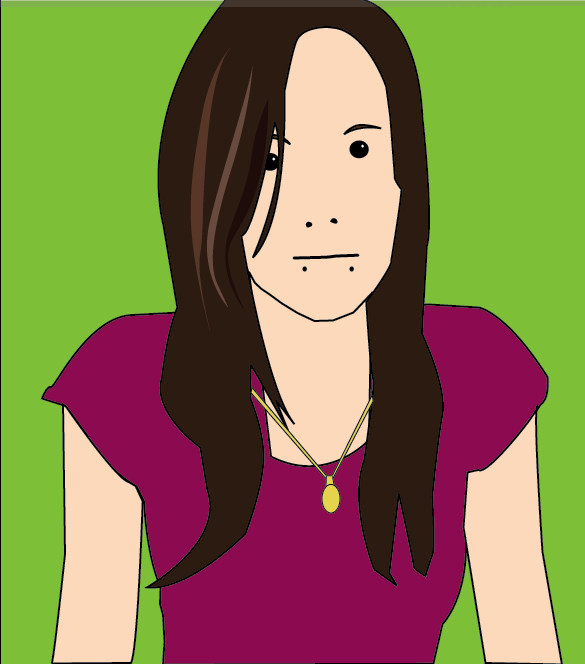
Julian Opie Style
This piece is done in the style of Julian Opie, a designer who created an album cover for Blur. We did this technique to show that we can follow the steps of another designer and produce a piece in the style of their work. This was created in illustrator by placing the image in illustrator and drawing around the image. The key is to keep to the style by making it simple. For the things like the eyes, eyebrows, mouth and nose you need to follow the steps of Opie by drawing the opening of the mouth, the nostrils, the pupil and the outline of the eyebrows, a highlight is always added to the eye and detail to the hair.

Fabric Collage
For this technique we used Fabric to collage onto a wallpaper surface. This is in the style of Clare Coles, the wallpaper artist of whom uses fabric for styling. . To create this piece I had to pick 3 pieces of fabric, a piece for the lighter shade of skin, a piece for the darker shading appearing on the skin and then the piece for the darkest in the picture. To create this I had my black and white image in front of me, drew around the areas and labeled then, cut out the pieces from the image to then place on the fabric and draw around, this would then create the different skin tones of the images from the lighting and the black and white image. I then put the pieces together on the wallpaper and sewed them ono the wallpaper. I decided that I would then get different material for the top and the used red cotton to sew the lips. I used a wallpaper from home to create a border, I also cut out a part of one of the flowers which I then put in the inside of the border.

Observational Drawings
In this project we also used the technique of drawing where we were to bring in our favourite shoe and draw it with our eyes close, from memory, continuous lines, outline and in detail. This was my detailed drawing of my favourite shoe.


William Morris Wallpaper
For this technique we was given the task of collecting leaves, flowers and anything else to create a William Morris inspired piece that can reflect beauty and be a piece that could be made into a wallpaper design. We had to draw 3 or 4 of these objects at a size no bigger than 15cm. After doing so we got some layout paper and drew a square 21x21cm which was then cut out, the square was then divided into 4 with pencil and a ruler and we was asked to make a bouquet, big at the top and smaller at the bottom by tracing around the drawings on the page. We then had to cut down the division lines we made and rotate the squares so that the piece on the middle was then facing the outer side. The middle should be empty so when taping the back of the paper you then go back and trace the middle but different to how you did so previously. This was then traced onto a bigger piece of layout paper repeatedly to create a repetitive pattern. This was to then be coloured up with pantone pens and scanned into the scanner to be worked up on the mac.
Patrick Caulfield Locket
We were to produce a piece in the style of Patrick Caulfield, a piece that represents us in some way; it was to be an object of importance to us. My object was my locket that I wear around my neck at all times. First I had to draw my locket and then from this drawing it was then photocopied and made bigger, it had been zoomed in to make pieces of which would show different parts of my locket, it was then these drawings that were traced onto layout paper and coloured up with pantone pens, This would show the interesting and important parts of my locket, the layout colours would be different in each box (6 boxes) to make it interesting on the page and more lively. I took a picture of my locket against white paper and then worked it up on the mac by drawing around my locket and producing a vector image on illustrator, live paint was needed to colour up the image in the case of the chain.