Wednesday 22 May 2013

London Trip


London Trip


For the London trip we went to the Pick Me Up exhibition to experience the different styles of others work.


 There was lots of different types of art displayed with the Pick Me Up Exhibition. Most of the pieces were created with the printing process but some look like they were created with a different technique because in some cases like this elephant it looks like it would have been hard to print unless it was a technique practiced constantly.

I think this illustration of the elephant is beautiful and is very realistic looking apart from the fact that the trunk is tied in a not and the bottom looks like it is turning into a blanket. This is very detailed and shows emotion within the elephants eyes however this image looks like it is based on a
horrible subject due to the trunk being knotted.
 As well as detailed realistic work there was also some cute looking illustrations that would be used for a child's book which is shown by the the simplicity of the image and the candy colours used brightly upon the page. There isn't much shading however in this case it works because it makes everything look bold and stand out. This looks like there is a little girl and a giant dog sitting in a flying flower of which has candy coming out of it; to me this looks like it could be symbolising a dream or it is a fictional story that is existing or has been created for the purpose of this piece.
 These printers stall was the most popular within the exhibition with people constantly around it asking questions of which I heard the man say that they are a team so the prints aren't a specific persons work it is all of theres. This piece is very beautiful with a Roy Lichtenstein style image in the morning that has been printed out and then the random smudges of ink around it and some words included that is to do with agents. This could be relevant to the image however it could also just be a decoration in which to make the image look more interesting and beautiful.
I think that this piece is very beautiful with the use of the horses in different positions forming the horses face itself, I do not think that this is printed for the fact that this would have been very fiddly or even impossible for the fact that the lines are very thin and perfect. The detail within the house is incredible for it is shown by the distance of the horses and the positioning of them. I think that the way it stops at the neck is a good decision for if it continued to the whole body of the horse then the image would be too much for the eye to take and it would not work.
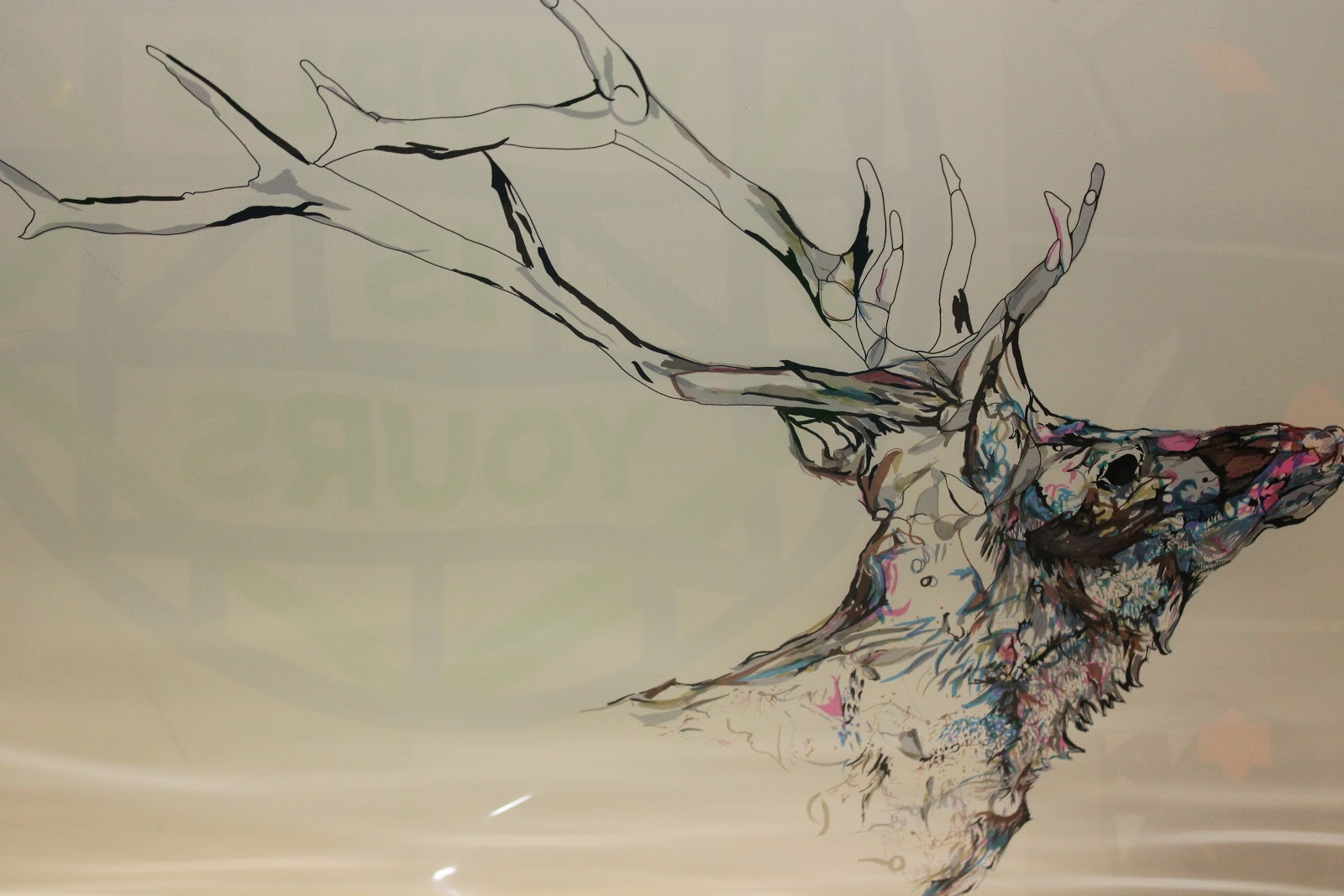
 I love this piece and think it is beautiful the way that they have used the colour to provide the deer with detail and colouring. This looks like a watercolour piece or a ink piece. It would have been done with a steady hand to produce the perfect lines and also i would have taken a long time to finish this piece due to the paint/ink drying because if done on top it would become ruined. I love the lack of colour within the antlers because it works really well and provides the detail to them however the colour on the deer shows the fur and features of the deer and works very well. Again I believe that if it continued anymore that the image will be too much for the eyes to handle
and therefore believe it was stopped at a perfect
place.
 This is a piece similar to that of Paul Catherall although there is bits that are drawn and left white however some bits are coloured in block colour and some bits like the sky that is using a shape to place the colour upon the page but leaving white gaps in the process, this piece would have taken a very long time as all the shapes would have to have been made to be able to produce the pattern within the sky. I like how although there is white gaps within the sky it doesn't clash with the birds of which you would think it would do. This stands out and is very beautifully constructed.

I love this piece because it reminds me of a stain glass window however in the shape of a flamingo or even the little ornaments that you can get that of this style. This looks to have been produced with ink or watercolour paints, there is different positions for each of the flamingos which is very interesting and looks amazing on the page. Only specific pieces are filled on like a stain glass window and the rest is white, I like the fact that pinks are used for the flamingos but different shades to produce a flamingo in the correct colour however also add some shading and interest to the flamingos.

I do not feel that this trip helped my FMP for I could not go to the National Portrait Gallery or the Tate due to us having to travel within groups for health and safety purposes although the pick me up exhibition was very interesting and helped me to discover different styles and techniques that come with printing as well as discovering new artists.

Web Update


Web Design


Above is the layers bar which shows the amount of frames I have used for each layer/page.


This is the home page of which is yet to be completed, the completion of this page will be done when I place the FMP final in the box with a tiny description added underneath of what it is. I feel that the final should be placed here as it is the last project of this course.

This is the about and contact page that has a little information about me and my gmail address for if people wanted to contact me about any work. The lizard on this page was the lizard I drew with the Wacom. This page is still slightly unfinished as I am going to add more about me and some more contact details however from what has been done of this page, I really like how the paragraph was separated and my lizards tail took the position of the paragraph space.

This is the gallery page of which consists of 20 odd frames at the moment, this is also unfinished in the way that I want to add a few more slides of pictures to this page however this can shortly be achieved and ready for the end of year show which is shortly arriving at college.


This website is to be completed for the end of year show at the college which will be in June. It will be displayed at the end of year show on a projector.

The Girl in the Mirror ~ Cathy Glass redesigning


My Design


This is The Girl in the Mirror design with the girl finally finished and scanned in and the mirror scanned in, made symmetrical and then coloured up brightly with shading added in areas to make it stand out more and make it bold. I decided upon bright and bold colours for the mirror so that it stands out but also so that it looks like something in which a child would happily hold. However she is left in a black and white colour scale for she is undergoing a bumpy road in the book and this shows the colour that a child should have in their life against the colour in which she has in her life.

Symbolism is very important when it comes to making a literal cover, this design is very literal to the cover name The Girl in the Mirror because there is a mirror in which the girl is in and also the mirror is surrounding by a beautiful symmetrical pattern, everything on this pattern is to symbolise the things that girls should like at that age and the colour symbolises the colour and happiness within a child's life. Her past being dark means that she is in black and white to express emotion, emotion in which is also seen in her eyes.

This design came out well but for improvement a background needs to be added of which could be a pattern, colour or even words that could be going through the girls mind while she goes through this trauma.

Below is the brief summary of the book:

When Mandy, 23, learns her much-loved Grandpa is dying, she readily agrees to stay at her aunt's house to help nurse him. Although the journey to her aunt's is familiar, from all her visits as a child, when Mandy arrives she finds she can't remember any of the house. Her mind has completely blanked it out. 

Mandy begins to experience strange and disturbing flashbacks and starts to delve beneath the surface of her respectable family to try and find out what happened. What she discovers is so shocking that she understands why it has never been spoken of, and why it lay buried in her sub-conscious for all those years


Link to Cathy Glass's website below:

Saturday 11 May 2013

The Girl in The Mirror - Cathy Glass redesigning

I decided to keep her nose and eyebrows but wanted her hair to be different from the hair in the photograph drawn from. I went with a wavy hair style that I feel compliments her face shape. I made her chin a little smaller and tried making we lips bigger although they could be improved on. I changed her eyes a little bit and added a bit of shading to give them a bit of life. She has little bit of baby hair at the top to show she is still young. I need to change her clothing and then start the shading ready for the scanning.

The Girl in the Mirror - Cathy Glass redesigning

I wanted to do an old styled mirror so looking online I found one of this shape however it had swirls and curls around it. I wanted to produce a mirror of which would catch the eye of a child because the story title is called The Girl in The Mirror. To make a symmetrical mirror I drew up half the mirror to then be scanned in and retouched up on photoshop.

After using photoshop to make my mirror complete, this is the result for my child mirror. This mirror is going to be bold and colourful to catch the child's eye however the girl inside will be black and white to symbolise the darkness once in her life, the colour of the mirror symbolising the happiness and colour that should be in a child's life.Coloured up versions to be uploaded.

The Girl in The Mirror - Cathy Glass Redesigning


Drawing the little girl to go inside the mirror for FMP subject. Changing up the hair and some features. Then shading and ready to scan in.