Sunday, 13 January 2013

Self Promo, First Project Techniques


Self Promo

Self Promo was the first project in College, the project was help us get an understanding of the different techniques and style of Graphic Design. This would give us an understanding of the techniques and help us to progress with different styles so we would have a variety of skill. This project was focused on me to give me an interest in the course at first. I really enjoyed this project because it was interesting learning the new techniques and styles and then applying them to my project. 


Mono Printing

Mono Printing is a very fun technique that is created with the use of ink. We used this technique to create work using the technique Andy Warhol uses. To create this piece is got my sheet of acetate an inked it up evenly, I then placed the newsprint upon the inked up acetate. After placing the newsprint down I then put my picture on top of the paper facing upwards so I can see the image and then getting a pen I drew over the picture. The texture and sharpness of the lines and shading depends on the pressure of the pen, finger or object used to draw around the pencil. Leaning on the page while drawing causes the ink to come up on the page with the amount of pressure your hand puts on the page. I did many different styles before getting this one and even did a continuous line drawing to show different techniques and how even though it is the same style it can be taken to the next level and made different with each print. In certain places you can see where the pen has been used and where my fingers have been used by the shading for example on my neck and left cheek. 
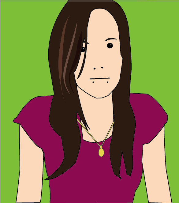

 Julian Opie Style

This piece is done in the style of Julian Opie, a designer who created an album cover for Blur. We did this technique to show that we can follow the steps of another designer and produce a piece in the style of their work. This was created in illustrator by placing the image in illustrator and drawing around the image. The key is to keep to the style by making it simple. For the things like the eyes, eyebrows, mouth and nose you need to follow the steps of Opie by drawing the opening of the mouth, the nostrils, the pupil and the outline of the eyebrows, a highlight is always added to the eye and detail to the hair.


Fabric Collage

For this technique we used Fabric to collage onto a wallpaper surface. This is in the style of Clare Coles, the wallpaper artist of whom uses fabric for styling. . To create this piece I had to pick 3 pieces of fabric, a piece for the lighter shade of skin, a piece for the darker shading appearing on the skin and then the piece for the darkest in the picture. To create this I had my black and white image in front of me, drew around the areas and labeled then, cut out the pieces from the image to then place on the fabric and draw around, this would then create the different skin tones of the images from the lighting and the black and white image. I then put the pieces together on the wallpaper and sewed them ono the wallpaper. I decided that I would then get different material for the top and the used red cotton to sew the lips. I used a wallpaper from home to create a border, I also cut out a part of one of the flowers which I then put in the inside of the border.


Observational Drawings

In this project we also used the technique of drawing where we were to bring in our favourite shoe and draw it with our eyes close, from memory, continuous lines, outline and in detail. This was my detailed drawing of my favourite shoe.


William Morris Wallpaper

For this technique we was given the task of collecting leaves, flowers and anything else to create a William Morris inspired piece that can reflect beauty and be a piece that could be made into a wallpaper design. We had to draw 3 or 4 of these objects at a size no bigger than 15cm. After doing so we got some layout paper and drew a square 21x21cm which was then cut out, the square was then divided into 4 with pencil and a ruler and we was asked to make a bouquet, big at the top and smaller at the bottom by tracing around the drawings on the page. We then had to cut down the division lines we made and rotate the squares so that the piece on the middle was then facing the outer side. The middle should be empty so when taping the back of the paper you then go back and trace the middle but different to how you did so previously. This was then traced onto a bigger piece of layout paper repeatedly to create a repetitive pattern. This was to then be coloured up with pantone pens and scanned into the scanner to be worked up on the mac. 


Patrick Caulfield Locket

We were to produce a piece in the style of Patrick Caulfield, a piece that represents us in some way; it was to be an object of importance to us. My object was my locket that I wear around my neck at all times. First I had to draw my locket and then from this drawing it was then photocopied and made bigger, it had been zoomed in to make pieces of which would show different parts of my locket, it was then these drawings that were traced onto layout paper and coloured up with pantone pens, This would show the interesting and important parts of my locket, the layout colours would be different in each box (6 boxes) to make it interesting on the page and more lively. I took a picture of my locket against white paper and then worked it up on the mac by drawing around my locket and producing a vector image on illustrator, live paint was needed to colour up the image in the case of the chain. 

Wednesday, 12 December 2012

Handmade Type


My Handmade Typeface


In our Typography Project we were given the task of creating our own Alphabet. This had to be placed into a grid and presented neatly on the page. 

We had to pick something to create this Alphabet with and so I decided on sweet wrappers. I thought that twisted roses wrappers would be the best of ideas due to the unique colour that the wrappers bring to the page and it would be more interesting than the wrapper on a page with a letter cut out of it.

I chose a grey background for the fact that it brings the colour out more and makes it look like they shine more. 

The space could have been used more wisely to prevent the letters bumping in to each other and joining but the alphabet has turned out nicely and can be identified.

Wednesday, 28 November 2012

Grid Website Layout


Web Layout:


Three Grid Column:

Above is a simple three grid column website design I did roughly,  although it is simple it has all the things that would be needed on a website which is a heading/logo/website name, Tabs (Home, Contact Us, About Us, ect...), Imagery and information. For this I decided on making it simple but putting all the tabs in one box, the heading at the top, the information underneath and an image underneath the tabs.


Six Grid Column:

Below are examples of a more sophisticated website design that I did roughly, this included the use of a six grid column which involved text for four of the columns and the images and little text in the two columns. Below is not just a home design but a layout for each of the tabs/button. As this is a design roughly for my website I had the idea of four tabs/buttons (Home, Contact, Gallery and Competition). Each tab has a design of which is different in some way; this is the layout I would like to use but have changes where I would like to add different types of flash imagery going across the page. The picture will not be the same on each page, it will show my favourite images, artists or pieces of work and say what it is on the picture in the corner, if you click on the image it will lead you to another picture which would be my inspiration from that piece or my own version of it. The flash illustration would be something to do with my like and will be different on each page to change to the next. 


Wednesday, 7 November 2012

File Formats ~ Web


HTML ~Hyper Text Markup Language, this is the coding used to display websites and other information displayed in a web browser. It consists of the use angle brackets and slashes to form the code with the information needed also for example:

This is a simple example of a HTML code of which I found on the website seen on the link below:
http://www.w3schools.com/html/tryit.asp?filename=tryhtml_intro

CSS ~ Cascading Style sheets, this is a style sheet language that is used for the describing of the look and formatting of a document that is written up in a markup language, HTML. This is for things like the font, colour, alignment and size.
This is another simple example which was also found on the same website:

FLA ~ FLA contains source material on the application Flash, this can be used for web for the use of flash design and also the use of creating buttons of which I have an example of from creating my own:

This is the normal timeline.


Whereas the one below is the scene timeline displaying the faces of the button.
SWF ~ Is an adobe flash file format that is used for multimedia, vector graphics and action scripts. This could be containing animations or anything needed to put on a website like activity on the page and buttons.

PHP ~ This is an open source which has the general purpose server, it has side scripting language which was originally designed for web development to produce dynamic web pages.

MYSQ Database ~ This is the open source relation database management system (RDBMS) of which runs as a server providing multi-user asses to a number of accounts.

FTP ~ File Transfer Protocol is the standard network protocol which is used for transferring files from one host to another over a network.

HTTP ~ Hyper Text Transfer Protocol is an application protocol that is used for distributed, collaborative, hypermedia information systems which is the system of data communication for www.

File Formats


.PSD ~ A PSD is a file format on photoshop, images in photoshop are bitmap. PSD is only for adobe photoshop and keeps all the layers in tact so that when you reopen it everything will be there.


This is an example of the layer pallet in photoshop, when opening up my Borough Market editing photoshop document this comes up in the layers pallet showing the last thing I did to my manipulated item and keeping it in tact for if I then wanted to do more to it.


.JPG-RAW ~ A JPG is a file format for images that can be opened on anything, a windows computer, mac, phones act. It is an image that has been compressed, pushed together to produce a picture, all the layers would have been pushed together without being edited. Whereas RAW is also a compressed file format for images but you can compress it yourself by editing them first without having a jpeg and then editing it in photoshop.

.TIFF ~ A Tiff is an Tagged Image File Format that is used for storing images like JPEG. Gives a higher quality image for when you print.

.PNG ~ A PNG is a Portable Network Graphic that makes the background of a bitmap image transparent.

.GIF ~ A GIF is a Graphics Interchange Format which gives an image transparency so that when going on a page it can overlap a image but not have a white background covering the image up, it is also used for making little animations and used in videos.

.AI ~ A AI is file format in illustrator, images in illustrator are vector if converted. AI keeps the vectors clean and crisp.

.IND ~ A IND is a file format in InDesign which saves all the text and images safely for when you go back on the document but when going back on the format, if having photos on the document you have to change the image quality.

.PDF ~ A PDF is a Portable Document Format which is used to represent documents in an independent manner of application software.

Bitmap ~ A bitmap can not be stretched due to being a pixel image it shows you the pixel grid of which is made up of squares, this means that when making an image bigger to print it the image will pixelate like this :

Vector ~ A vector can be stretched and give a clear and crisp image without the use of pixelation being shown, this means that we can then make the image bigger to print it shown by the image below:

Both these images were zoomed into 1200%

Web Design Research


In our Web Design lesson we have been asked to do some research, this involved us finding a website of which would help us to decide our layout for our website we create.

From looking at the website below I found this Bottle Bell Photography:
http://www.thephotoargus.com/inspiration/40-great-photographer-portfolio-websites-for-inspiration/

Bottle Bell Photography has an amazing professional website of which looks rather spooky to the eye at first. It starts up with some music and a dimming light like a horror. The light has words appear in it like "conceptual", "emotive" and "transcendent" before coming up with the final "BOTTLE BELL PHOTOGRAPHY". If you want to miss this intro it has the option at the bottom of the screen. the colouring is simple with the use of black and a creamy colour between green and yellow (like a brown). The website has a textured flower background (like wallpaper) to make it a sophisticated website.

After the intro, the website goes straight to the gallery where you then click on a image of the four displayed to pick a category of photography you would like to look at. It goes straight to the set of photographs where it then is displayed as a small slideshow with a little information about the selected category at first, this slideshow can also be viewed at full screen of which is helpful as the photos are not particularly big. The name of the photograph is viewed above.

I like this website because it is different from other photography websites with the use of a slideshow and being presented as a film at first making it more interesting to look at. Out of all the websites I looked through this was my favourite as well as another website.

The website is seen on the link below:
http://www.bottlebellphotography.com/

Typography Dip


Today I got given my task for my Typography project through a lucky dip.

We were to pick a font from the bag, the font we got we would then research into and give our own opinion on them, after all the research is done I will have to create a poster of the good points about the font i had picked in the dip, the font that I got is Eurostile.

We then had to pick 2 more things of which involved a letter and a character although some people would get 2 letters. I was lucky enough to get 2 letters of which are L and P. With this task we need to find something to represent the letter like A is for apple, we need to make a poster like this with something that is not inappropriate but something that is suitable to our age group. We will then illustrate the letter ad character for the poster like for the letter you would have that big in the middle of the page and then something that represents it will be small on the letter.