Showing posts with label Artist research. Show all posts

Thursday, 6 June 2013

Rik Lee


http://www.rikleeillustration.com


 Working with grey lead pencils, texts, watercolours and his computer to create masterpieces is an artist called Rik Lee who lives and draws in Melbourne, Australia. Rik has worked for a range of clients that include American Express, Nylon, Puma, Wired, Vodaphone, Air New Zealand, Virgin Australia, Telstra, Vibe, Vice, Dotti, Clandestine Industries. Hurley, Honour Over Glory, Stussy and The Itailors.


From studying Graphic Design to becoming a Freelance Illustrator

Rik studied Graphic Design however it bummed him out and he decided to focus more on his illustrations because it made him happy and it meant he was doing what he loves, instead of leaving the Design School he decided to stay and produce an illustration portfolio however this caused him to get a lot of grief from his lecturers of whom were annoyed with him for drawing everything even typography. Rik graduated with a portfolio he was proud with however one that no design company wanted anything to do with. Rik carried on drawing and ended up picking up some freelance gigs and is now illustrating for a living.


Mediums and Processes

Rik's works have a range of different media used, first he will started off with a red outline (Faber Castell "Polychromos" pencils, the red is his favourite) for the basic lines where he would then be able to trace over the lines that he wanted in a darker tone. 

The lead of all the coloured pencils differ slightly and Rik found that the blacks and greys are scratchy and good to use so he decided upon using the red because it is soft and draws perfectly. These reasons being why he uses the red pencil first as he then stated "I began to draw almost exclusively in red. It comes down to personal preference. Like all my techniques, I have discovered them through trial and error. I suggest you do the same. Mess around, and find out what works for you. every artist is different and every artist will prefer different mediums. While I may like the red pencil, another person may prefer blue or green. Try them out and decide for yourself."

When the line work and shading is drawn by hand in pencil and the occasional marker pen/sharpie he will sometimes scan in the illustration to then manipulate it in photoshop by adding colour and more. However sometimes he will continue working by hand by colouring it with gauche or watercolours but in some cases he will leave the piece as a pencil drawing on paper. The medium used for each piece depends on which Rik feels would work best and a medium which he is confident with using. The paper that he uses is Arches Smooth Watercolour Paper.

Rik's Interests

Rik has his other interests outside of his drawing of which involve trying not to fall off his skateboard, talking in detail about the weather (Storms being his favourite). He plans to draws more in the future as well as travel more, get more tattoos, drive a '67 Chevy Impala and move down the Coast with his girlfriend and his dog.

Some examples of Rik's works below:


Wednesday, 5 June 2013

The Kids Are Losing Their Minds ~ Rik Lee


When looking through Rik Lee's website (http://www.rikleeillustration.com)  I saw this typeface that he has created and illustrated. This is the only typeface seen upon his website and one of the rare pieces with the men being used but as well as men there is also also other things that show animals, scenes or objects. I really like this typeface and think it is beautifully illustrated with different illustrations in each.

I think that in some cases the illustrations were thought about for the creating of the letter but in other cases clipping masks would have been used. I think that the first T and H work very well as well as all the I's, the A and E in are and then the L and O in losing work very well. I think that these are the ones that were thought about because they fit into the letter perfectly and even make the letter in their own way especially the T,H,I,A and E.

I like how the colour scheme consists on 3 colours that are repetitive and go nicely together for the darkness is the same with each of the colours and they do not clash nor dull each other out. The illustrations that do not make the letter fit in nicely because you can still see letters and it also looks pretty, I like the people being used in the letters as well as the animals and scenes such as Vegas diner.

Work Similarities


Pick Me Up Exibition Work VS Rik Lee


These pieces of work were seen at the Pick Me Up Exhibition. When seeing these pieces of work it immediately reminded me of an artist that I had found out shortly before this exhibition.

Although these are very different to what Rik Lee has produced they have similarities which will be discussed in this blog post.

This artist has their work on a white background and they use 3 colour of which are white, black and pink. The designs look like they are shirt designs and also have a lot of detail of which are the tattoos and the detail in the hair for the man. In the images most of it is outlines rather than fills which is interesting for the woman however I think that the image of the man looks wrong where his hair has the detail and feel that this should be filled in black like the woman's hair.

Out of the two pieces produced by this artist I prefer the woman because she looks better with the hair, the way her body cuts out and also I like how her tattoos aren't all filled in.

Rik Lee's work focuses on the tattoo side also but in a very different way to the artist above. In most of his art works, Rik also uses 3 colours of which are black, white and blue however he changes the opacity of the black to get different shades therefore having grey in the colour scheme for the shading. Rik focuses on the women in his work having a limited amount of men used within his designs, not only does his work focus on the tattoos it also is in a tattoo style which is also shown with his signature and the text on his work for it is using a typeface often used when type is tattooed. I prefer the style of Rik Lee rather than the artist displayed above for rik puts more detail within his work and brings realism within the art with the use of the shading. The tattoos are all seen in a darkish blue, this is to make it stand out against the harsh black with a bit of colour as well as make it stand out against the skin tone shading.


My favourite from the 3 pieces of Rik's work seen to the right would have to be the first one because of the detail in the image and the simplicity of the colours as the one at the bottom has a bit too much colour when the lips and nails are always coloured in however i like the melting effect on her jacket. For an improvement to the bottom image I think that her other jacket sleeve would need to be coloured in to complete the look and more shading to be added into her hair. The top 2 piece of his focuses more on the tattoos and have a lot more shading to show the tone but the first is my favourite because she is facing head on and the tattoos are spread out amongst her instead of just one place. I also like the way that She fades out because the fact that she was faded out is very clean and doesn't look weird however with the arm it looks weird because there is no connection to anything and the arm appeared from nowhere.


I think that the tattoos being in blue is a good idea because it stands out against the harsh black and stands out against the toning of the ski however i think that the blue is off-putting in some points where it looks to much and wrong in cases like the first 2 images because it is all black and white however when it is a cade of having quite a bit of colour already within the image like the one to the right it doesn't looks so bad and isn't so much noticeable due to the colour already being on the piece.

Wednesday, 27 March 2013

FMP ~ Artist Ideas


RANKIN


I would like to do a photoshoot in the style of RANKIN for his style tends to be dark as well as light. This image is one of many that RANKIN took to highlight the reason why two thirds of blind people in the World are women, this was for a campaign created by charity Sightsavers International. It was launched for World Sight Day which takes place on 8th October to raise awareness of the plight of these women of whom around 90% of them live in developing Counties.

This has a dark look to it with the use of the amount of makeup on them and the flies being attracted to the makeup, I would like my photoshoot to be dark but have a light aspect to it. For Example, on the cut cover I would like there to be a child looking down at there arm where there would then be fake blood located to give it a meaning towards the title, this would represent the bad things that has happened in their life, there will also be a dash of bright light touching the "wound" which will represent Cathy healing them however for the back I would like a picture of them standing up looking happy and showing there wrists and there being no sign of a scar or blood for time with Cathy has healed them.


MARTIN ANSIN


I would like to do an illustration in the style of Martin Ansin for his piece to the side is based around memories and thoughts within the head. I thought this would be a good idea for it could be used in some way for the book cover designs.

 I think this would work because on the front it could be the child with a sad or straight expression on their face and they have all the bad memories rushing through their head, this would be to give the darkness to the cover however for the back cover I would like to do it completely different by having them look really happy and having memories they have made with Cathy now running through their head.


KAREENA ZEREFOS


I would like to do an illustration in the style of Kareena Zerefos due to the fact that her style looks very realistic but has pieces that would not be realistic for example, the picture to the left shows that the child is a fox although this could not be possible I think this idea would work for my book covers.

I would like the cover to be of a child who is an animal like Kareena's piece but the twist is that I would like the animal to be a animal that has strength and courage, this will then represent the pain the child goes through and how even though it damages them they stay strong. On the back I would like to do it so that it is a back view showing that they don't need to be strong no more because they have had happiness and new memories that have made them realise they shouldn't feel like they do; or I would like to do it so they have turned back into a human child where they don't need to be strong no more.


SILVIA PELISSERO 

I would like to like to do an illustration in the style of Silvia Pelissero of which I would base around the 2 images of hers seen to the left.The first one would be relevant because I would like to do it as if it were the children disappearing and on the back they are reappearing and have colour to them. This is to display the past making them feel invisible and showing that the pain is making them feel they are disappearing. The back would show the strength they have gained while with Cathy and make them realise that the happy moments will keep them going.

 For the picture to the left I would like to do faces that show great emotion for the cover whether it show them crying on the front and happy on the back or whether it be mixing the style with Kareena Zerefos by creating the illustration and then adding tears which on the front cover will then make the paint run down the page to express their feelings of feeling they are being faded away into nothing.


NICOLETTA CECCOLI


I would like to produce an illustration in the style of Nicoletta Ceccoli based upon the 2 images to the left. These will be very relevant due to the emotions within the pieces. I would like to do one similar to the first piece for I would have the child hiding behind the mask to show strength or shyness that needs to be broken away from so they can live a happy childhood without the worry and strength that should come with being an adult. On the back of the cover I would like it to be so that they have completely come out of their shell and are coming away from the responsibility to be strong for those around them like shown slightly within the picture. This artist has work that could be classed as dark for the fact that some of the imagery includes the use of death, blood and unhappy endings. This would be relevant for the fact that some of the stories have a very dark past.


I would also like to do one in this style because it shows fear within her face, she is scared and is therefore cuddled up with her pink bunny. This would be a very interesting approach to the cover as it will show the child sitting curled up scared with and some thoughts can be above the head area but on the back it will be of the child standing up clearly and looking happy with happy thoughts surrounding her in the background . 


http://www.nicolettaceccoli.com


I feel that the idea of the front and cover being different in some sort of way is relevant for it shows that even children in foster can have a happy ending if they allow themselves. It will also give the audience and understanding that if they consider fostering they sometimes need to look past the brave face and see the pain and suffering which is hidden behind the smile the child wears so well.

Sunday, 13 January 2013

Self Promo, First Project Techniques


Self Promo

Self Promo was the first project in College, the project was help us get an understanding of the different techniques and style of Graphic Design. This would give us an understanding of the techniques and help us to progress with different styles so we would have a variety of skill. This project was focused on me to give me an interest in the course at first. I really enjoyed this project because it was interesting learning the new techniques and styles and then applying them to my project. 


Mono Printing

Mono Printing is a very fun technique that is created with the use of ink. We used this technique to create work using the technique Andy Warhol uses. To create this piece is got my sheet of acetate an inked it up evenly, I then placed the newsprint upon the inked up acetate. After placing the newsprint down I then put my picture on top of the paper facing upwards so I can see the image and then getting a pen I drew over the picture. The texture and sharpness of the lines and shading depends on the pressure of the pen, finger or object used to draw around the pencil. Leaning on the page while drawing causes the ink to come up on the page with the amount of pressure your hand puts on the page. I did many different styles before getting this one and even did a continuous line drawing to show different techniques and how even though it is the same style it can be taken to the next level and made different with each print. In certain places you can see where the pen has been used and where my fingers have been used by the shading for example on my neck and left cheek. 


 Julian Opie Style

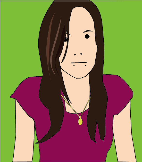
This piece is done in the style of Julian Opie, a designer who created an album cover for Blur. We did this technique to show that we can follow the steps of another designer and produce a piece in the style of their work. This was created in illustrator by placing the image in illustrator and drawing around the image. The key is to keep to the style by making it simple. For the things like the eyes, eyebrows, mouth and nose you need to follow the steps of Opie by drawing the opening of the mouth, the nostrils, the pupil and the outline of the eyebrows, a highlight is always added to the eye and detail to the hair.


Fabric Collage

For this technique we used Fabric to collage onto a wallpaper surface. This is in the style of Clare Coles, the wallpaper artist of whom uses fabric for styling. . To create this piece I had to pick 3 pieces of fabric, a piece for the lighter shade of skin, a piece for the darker shading appearing on the skin and then the piece for the darkest in the picture. To create this I had my black and white image in front of me, drew around the areas and labeled then, cut out the pieces from the image to then place on the fabric and draw around, this would then create the different skin tones of the images from the lighting and the black and white image. I then put the pieces together on the wallpaper and sewed them ono the wallpaper. I decided that I would then get different material for the top and the used red cotton to sew the lips. I used a wallpaper from home to create a border, I also cut out a part of one of the flowers which I then put in the inside of the border.


Observational Drawings

In this project we also used the technique of drawing where we were to bring in our favourite shoe and draw it with our eyes close, from memory, continuous lines, outline and in detail. This was my detailed drawing of my favourite shoe.


William Morris Wallpaper

For this technique we was given the task of collecting leaves, flowers and anything else to create a William Morris inspired piece that can reflect beauty and be a piece that could be made into a wallpaper design. We had to draw 3 or 4 of these objects at a size no bigger than 15cm. After doing so we got some layout paper and drew a square 21x21cm which was then cut out, the square was then divided into 4 with pencil and a ruler and we was asked to make a bouquet, big at the top and smaller at the bottom by tracing around the drawings on the page. We then had to cut down the division lines we made and rotate the squares so that the piece on the middle was then facing the outer side. The middle should be empty so when taping the back of the paper you then go back and trace the middle but different to how you did so previously. This was then traced onto a bigger piece of layout paper repeatedly to create a repetitive pattern. This was to then be coloured up with pantone pens and scanned into the scanner to be worked up on the mac. 


Patrick Caulfield Locket

We were to produce a piece in the style of Patrick Caulfield, a piece that represents us in some way; it was to be an object of importance to us. My object was my locket that I wear around my neck at all times. First I had to draw my locket and then from this drawing it was then photocopied and made bigger, it had been zoomed in to make pieces of which would show different parts of my locket, it was then these drawings that were traced onto layout paper and coloured up with pantone pens, This would show the interesting and important parts of my locket, the layout colours would be different in each box (6 boxes) to make it interesting on the page and more lively. I took a picture of my locket against white paper and then worked it up on the mac by drawing around my locket and producing a vector image on illustrator, live paint was needed to colour up the image in the case of the chain. 

Tuesday, 6 November 2012

Tom Lewis~ Manga Artist


Browsing through a facebook page about visiting Japan, I found a post about a London-based Manga Artist called Tom Lewis and when searching his work I found some really beautiful pieces he created. From looking at the two on the left it gave me some inspiration for my Web Design. I could have a little character of myself with a tree coming out and things I like on the branches like in his work and the items on the branches would be my buttons so when clicking on one it will bring up a screen and would include all of the things needed of that button. I think this would be interesting because it will not be boring, there will be movement in the webpage and I could use flash to make wind come across the page and move the buttons side to side as if wind had hit them. Therefore making a very sophisticated, interesting website with the use of movement, creativity and uniqueness as well as having a part of me in the website more.

I love Tom's work because even with the use of Dark Colours, it doesn't look depressing. It has beauty which I haven't seen in many other illustrations, it brings a smile to my face with how beautifully it is done and how much it stands out with the use of colour. The lines are beautifully drawn out showing the concentration and dedication to making a wonderful, sophisticated, unique and gorgeous piece that can touch the heart with one look. Another reason I love it is because of the inspiration of Japan, his pieces bring the beauty of Japan to them with the simple use of the Kimono and the Japanese writing. I love Japan personally which brings more excitement to his piece for me and makes me love them more.

His website is seen on the link below:
http://www.tomlewis.co.uk/

Information about him seen in the link below:
http://www.sabotagetimes.com/reportage/tom-lewis-the-urban-artist-with-talent-to-burn/

Thursday, 13 September 2012

Work Simularities


I found the picture to the left, done by Kelli Murray, on her blog in sketchbook pictures. I have made this blog entry because looking at this piece it reminds me of another piece of art I have seen.
This piece reminds me of Rapunzel in the disney film Tangled. This is because in the film, Rapunzel hides in her hair like in the Kelli Murray image.
The image of Rapunzel is located in the link below:
http://media.photobucket.com/image/recent/ashley_serena/hairhut2.gif


Wednesday, 12 September 2012

Inspirational Artists part 3


Kelli Murray is an artist I studied in secondary, she was an Artist in which I based my final piece in Graphics on.

Kelli is an artist born in San Diego, CA in 1984, her work is styled to fit fashion which is because this is something she enjoys and something she can do when designing outfits. Her style is illustrative and cute of which works well to produce pretty and effective fashion pieces.

Kelli is now the head designer of Jedidiah Clothing Company, it is her illustration, design skills and style which produces a fashion line that speaks to the heart of its devoted clientele. Her style displays a distinctive hip and urban feel which has been shown by the imagery showing innocence and hope.

I like Kelli's style because it is a different and fun way to show a fashion clothing line with the use of imagery you would not see anywhere else, the colours are girlie as well as the clothing style which of course shows that the clothing is created and designed for women. The images are unique with a background behind it matching the image perfectly of which I have found is shown in the bottom two images, it shows what inspired her and how she has used the design material to make her own.
The top image shows a model and the drawing next to it, this shows that she designed the outfit and then created it for the clothing line, the model is herself.
Her work can be found on the link below:

Inspirational Artists part 2


This work was created by  Oliver Winconek,  an artist of which has been working in Kent for the past 5 years since moving there. His work is inspired by his everyday encounters of people and events, his work is a signature of how he sees the World in his perspective.

His work is in a street art type of style if looking at his work you can see the street art influence, the link below has his gallery of work located on it:
http://www.oliver-winconek.co.uk/index.html

His work is created from stencils of which are hand-cut from  original photographs, his painting materials are a combination of spray paint and acrylic paints.


The pictures to the left are paintings of which are of a person called Emily, they show a good use of tone and colour but the fact that the imagery is rather dark could mean that at the time he was feeling depressing or when he saw the photography he felt they were depressed. Emily is looking down and her stare is looking empty which could show she was upset or depressed, although this could have been a pose I believe it was taken as a depressing state by artist Oliver Winconek of which he then thought about and it appear depressing in the painting.


Wednesday, 5 September 2012

Inspirational Artists


This work done by Rome-based artist, Silvia Pelissero is truly inspiring with the use of bright colours adding interest and capturing the eye. Her work is beautifully effective and something always interesting to look at.

Her pieces are created with the use of watercolour paint and white fine pen. The idea of the water running the paint down the face is her way of making her work different to every other artist, although the paint running down the page can be classed as messy it works very well with her pieces and makes them look more beautiful and unique. She likes to flick the paint upon her pieces also known as something messy but made beautiful with her creative mind.

She is my favourite artist of which I shall use as an influence in my hand created work. She is a very inspiring woman who lures you in with her beautiful, realistic art.

Her professional DeviantArt is linked below:
http://agnes-cecile.deviantart.com

Her youtube showing her speed painting is linked below:
http://www.youtube.com/user/agnescecile?feature=watch

Her Website is lined below:
http://agnes-cecile.cleanfolio.com/