London Trip

For the London trip we went to the Pick Me Up exhibition to experience the different styles of others work.
There was lots of different types of art displayed with the Pick Me Up Exhibition. Most of the pieces were created with the printing process but some look like they were created with a different technique because in some cases like this elephant it looks like it would have been hard to print unless it was a technique practiced constantly.
I think this illustration of the elephant is beautiful and is very realistic looking apart from the fact that the trunk is tied in a not and the bottom looks like it is turning into a blanket. This is very detailed and shows emotion within the elephants eyes however this image looks like it is based on a
horrible subject due to the trunk being knotted.
As well as detailed realistic work there was also some cute looking illustrations that would be used for a child's book which is shown by the the simplicity of the image and the candy colours used brightly upon the page. There isn't much shading however in this case it works because it makes everything look bold and stand out. This looks like there is a little girl and a giant dog sitting in a flying flower of which has candy coming out of it; to me this looks like it could be symbolising a dream or it is a fictional story that is existing or has been created for the purpose of this piece.

These printers stall was the most popular within the exhibition with people constantly around it asking questions of which I heard the man say that they are a team so the prints aren't a specific persons work it is all of theres. This piece is very beautiful with a Roy Lichtenstein style image in the morning that has been printed out and then the random smudges of ink around it and some words included that is to do with agents. This could be relevant to the image however it could also just be a decoration in which to make the image look more interesting and beautiful.

I think that this piece is very beautiful with the use of the horses in different positions forming the horses face itself, I do not think that this is printed for the fact that this would have been very fiddly or even impossible for the fact that the lines are very thin and perfect. The detail within the house is incredible for it is shown by the distance of the horses and the positioning of them. I think that the way it stops at the neck is a good decision for if it continued to the whole body of the horse then the image would be too much for the eye to take and it would not work.
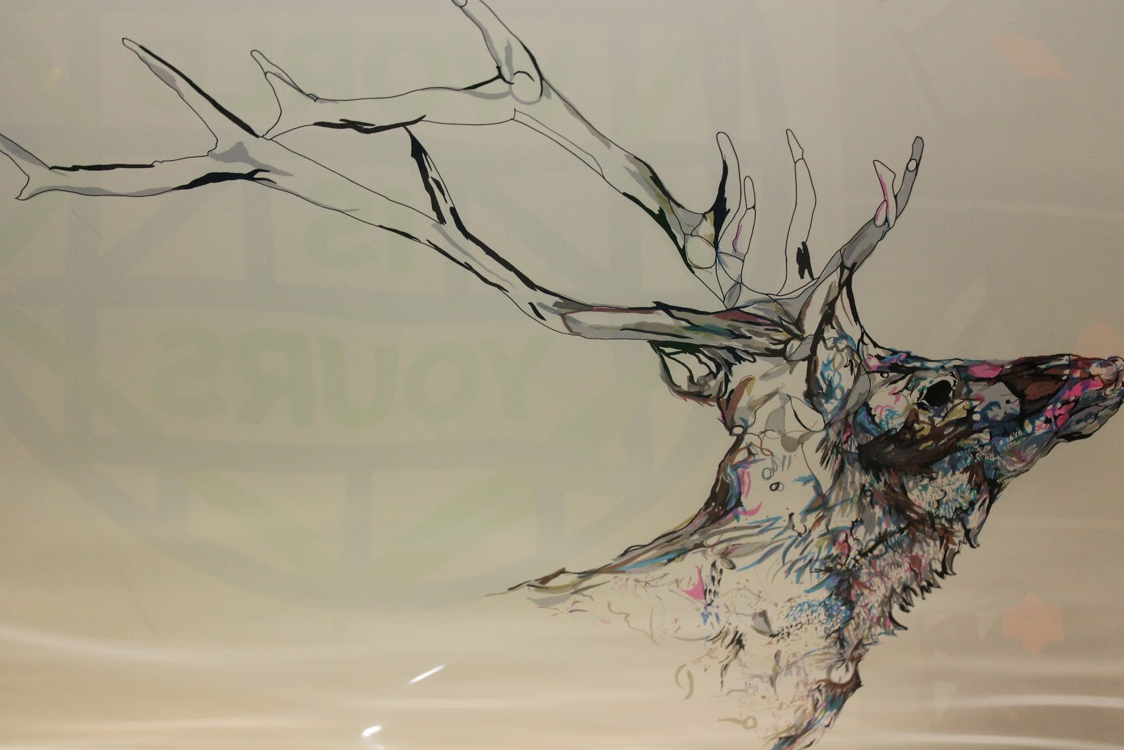
I love this piece and think it is beautiful the way that they have used the colour to provide the deer with detail and colouring. This looks like a watercolour piece or a ink piece. It would have been done with a steady hand to produce the perfect lines and also i would have taken a long time to finish this piece due to the paint/ink drying because if done on top it would become ruined. I love the lack of colour within the antlers because it works really well and provides the detail to them however the colour on the deer shows the fur and features of the deer and works very well. Again I believe that if it continued anymore that the image will be too much for the eyes to handle
and therefore believe it was stopped at a perfect
place.
This is a piece similar to that of Paul Catherall although there is bits that are drawn and left white however some bits are coloured in block colour and some bits like the sky that is using a shape to place the colour upon the page but leaving white gaps in the process, this piece would have taken a very long time as all the shapes would have to have been made to be able to produce the pattern within the sky. I like how although there is white gaps within the sky it doesn't clash with the birds of which you would think it would do. This stands out and is very beautifully constructed.

I love this piece because it reminds me of a stain glass window however in the shape of a flamingo or even the little ornaments that you can get that of this style. This looks to have been produced with ink or watercolour paints, there is different positions for each of the flamingos which is very interesting and looks amazing on the page. Only specific pieces are filled on like a stain glass window and the rest is white, I like the fact that pinks are used for the flamingos but different shades to produce a flamingo in the correct colour however also add some shading and interest to the flamingos.
I do not feel that this trip helped my FMP for I could not go to the National Portrait Gallery or the Tate due to us having to travel within groups for health and safety purposes although the pick me up exhibition was very interesting and helped me to discover different styles and techniques that come with printing as well as discovering new artists.


